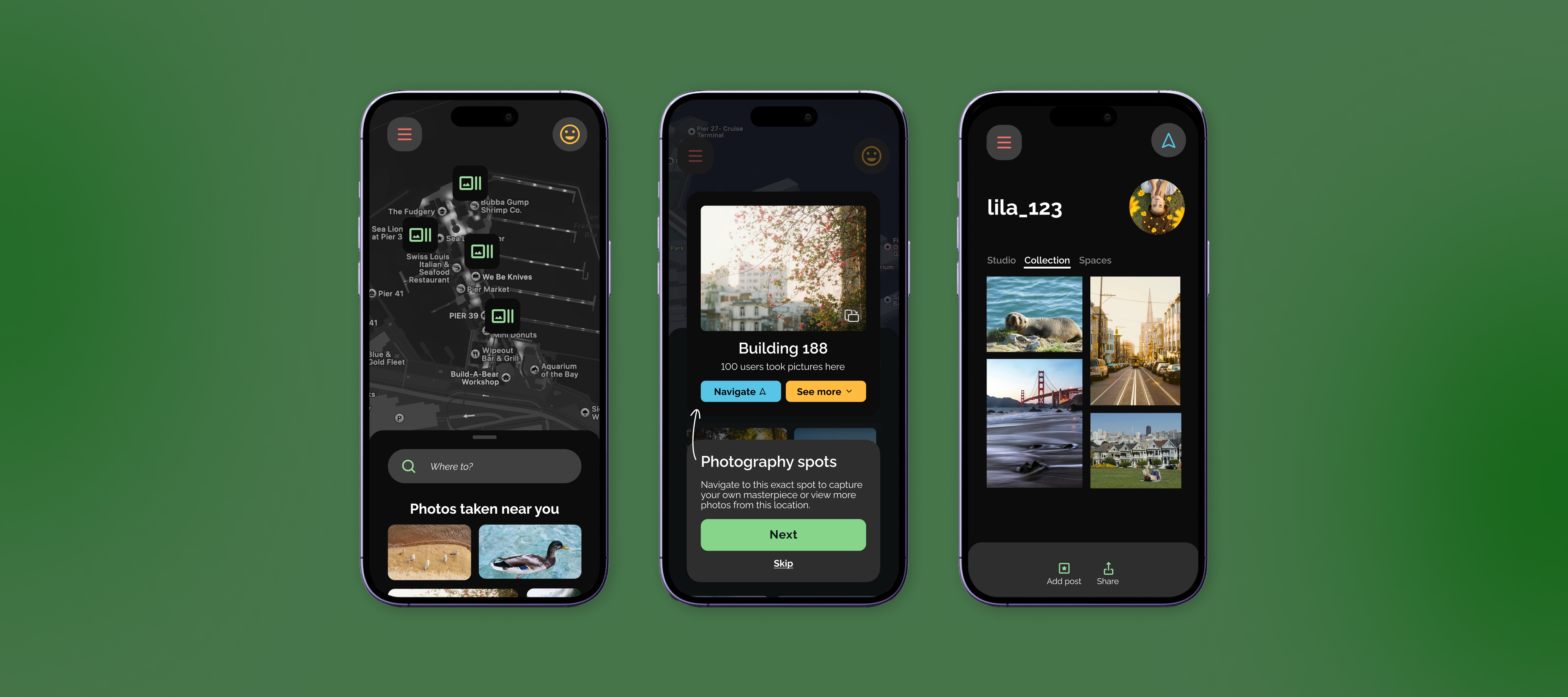
Wander Mobile App
Wander started as a class constraint: combine two dissimilar apps into a a single meaningful product. I chose Waze and VSCO, apps I had never used before, to avoid avoid familiarity bias and let function lead the concept. Over 8 weeks, I reframed the brief into a problem about creative behavior, conducted user research with photography enthusiasts, designed a mode-based architecture for dual mental states, and built a first-time user experience guided by Fogg's Behavior Model.
The brief was to combine two apps but the deeper challenge was deciding why they should be merged at all. I asked three questions: who would it serve, what behavior it would change, and what unique value would the combination unlock that neither product could achieve alone?
I started by looking at the two apps and their core features: Waze helps you get somewhere and VSCO helps you make something beautiful once you arrive. The overlap? A photographer searching for the right place to capture that moment.
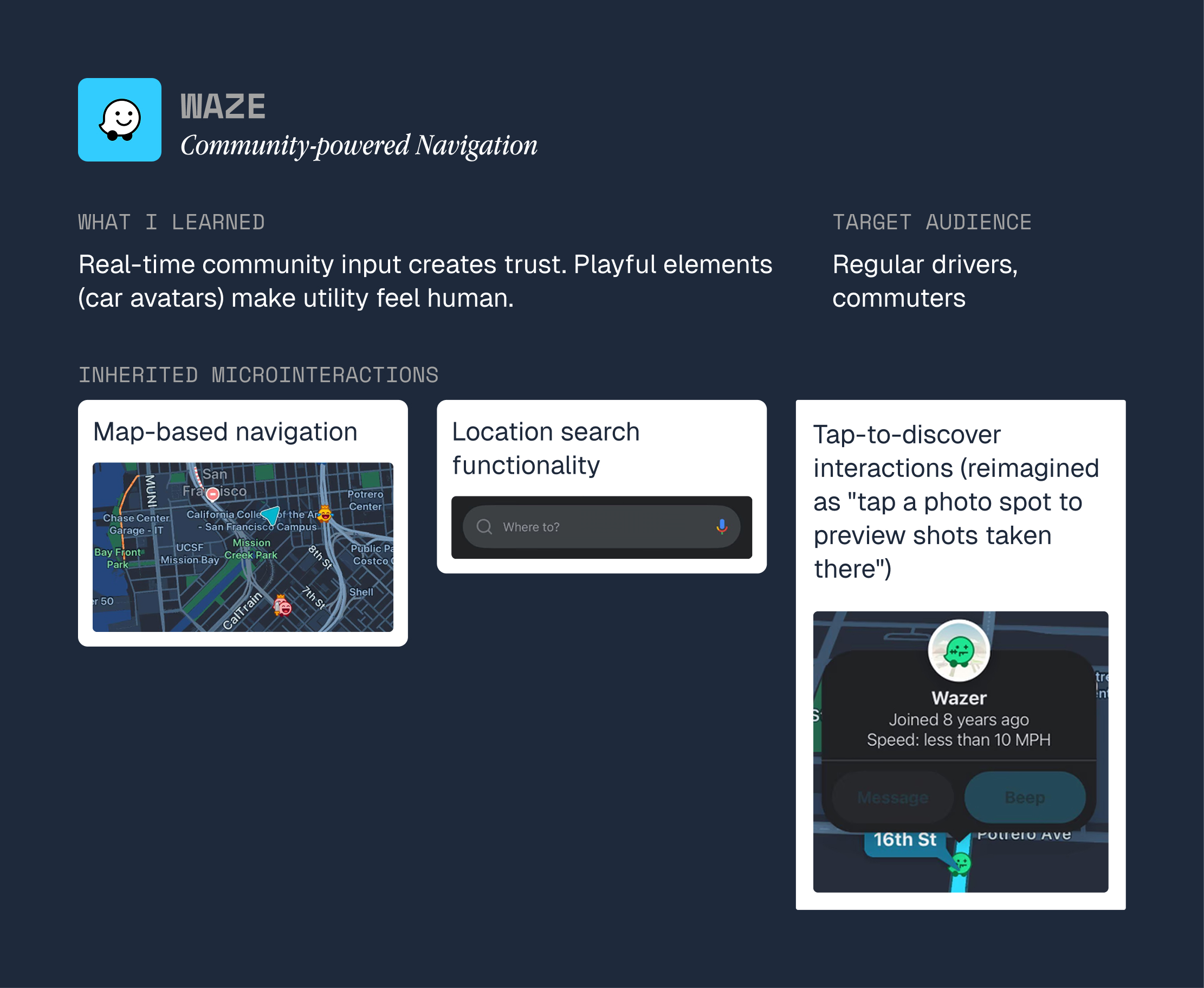
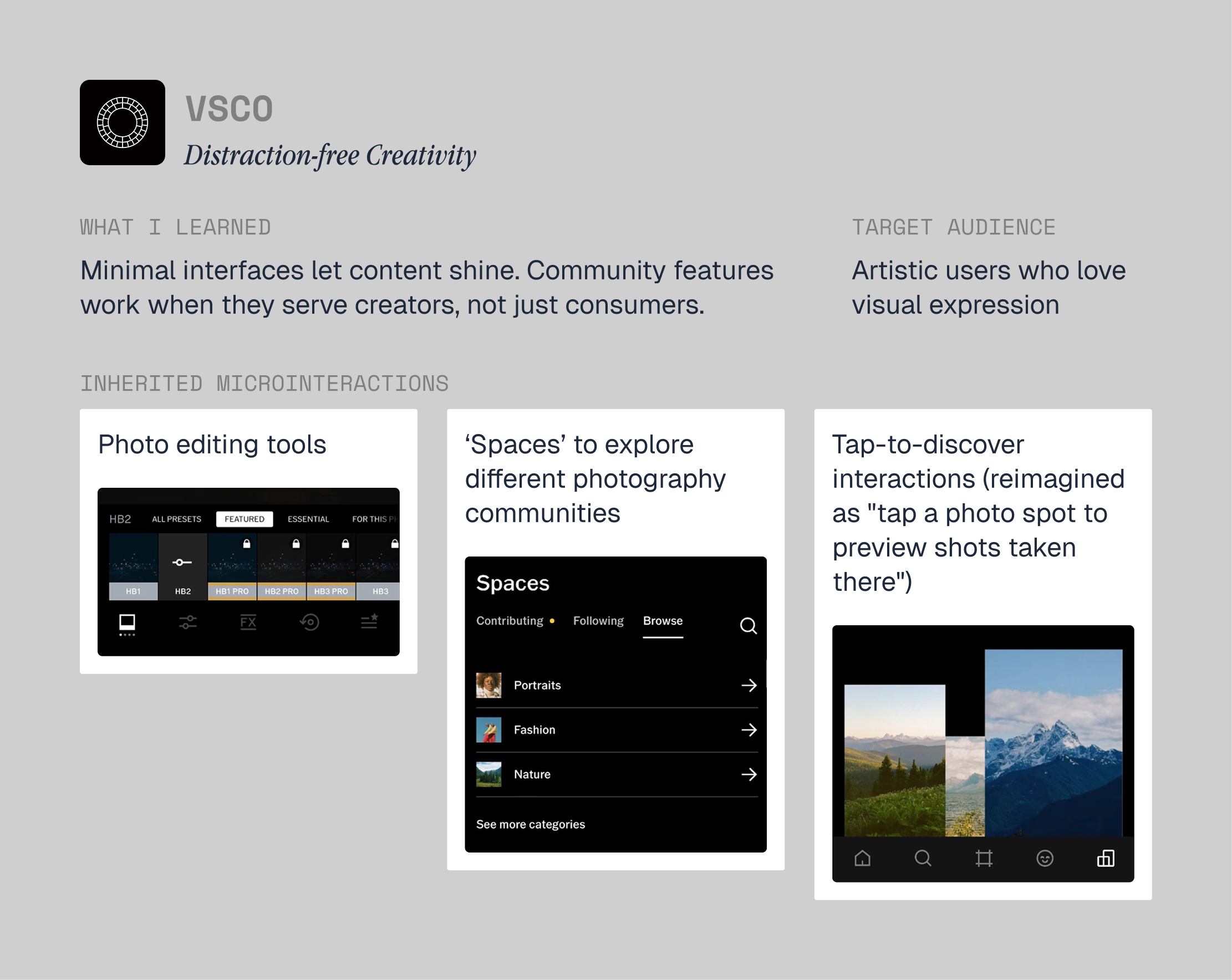
Functional analysis of Waze (left) and VSCO (right)
I interviewed 3 photography enthusiasts about their location-finding process. The struggles were consistent: too many apps, vague directions to specific spots, creative momentum lost in the gaps between them.
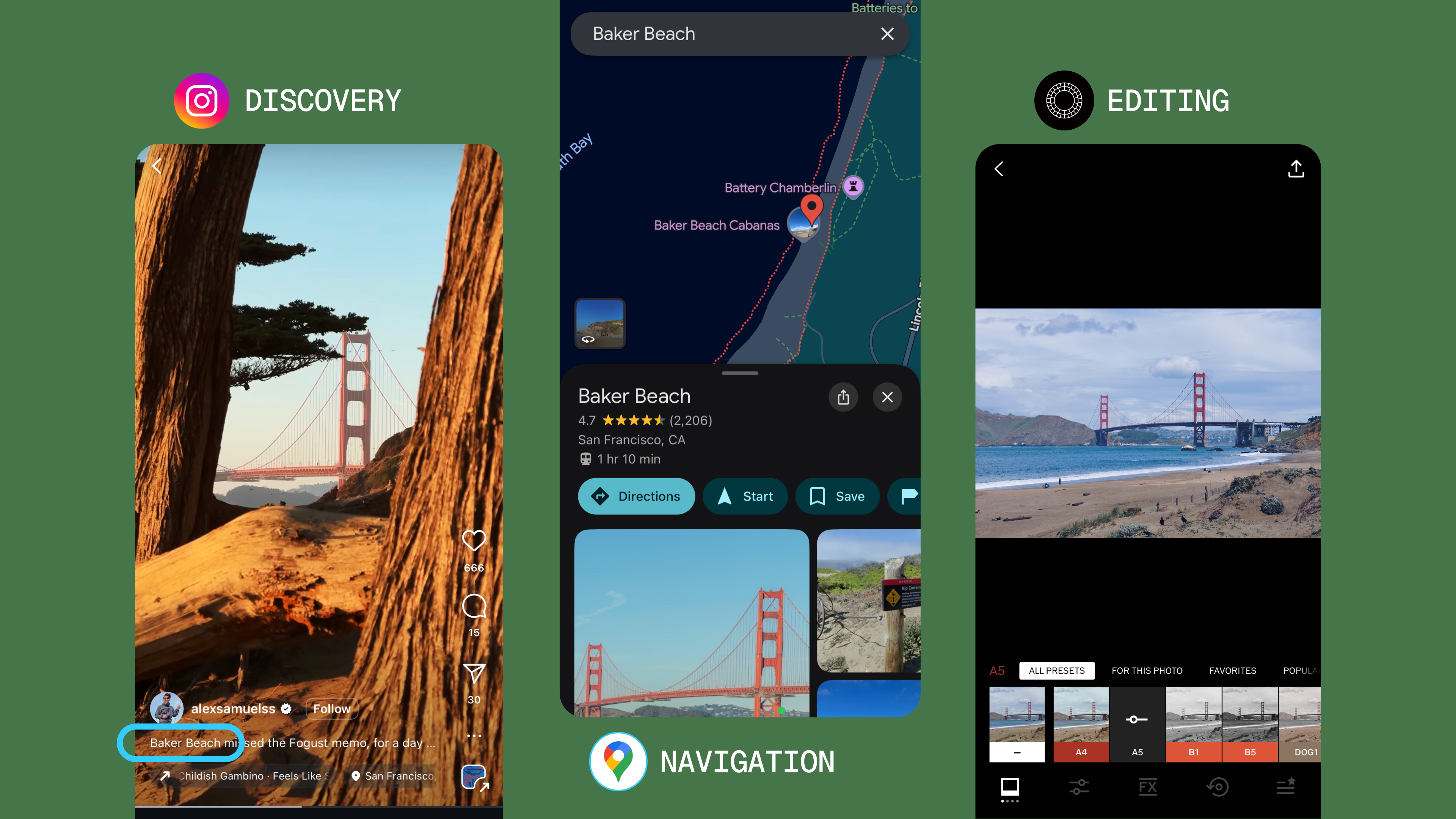
Photographers struggling with multiple tools switching
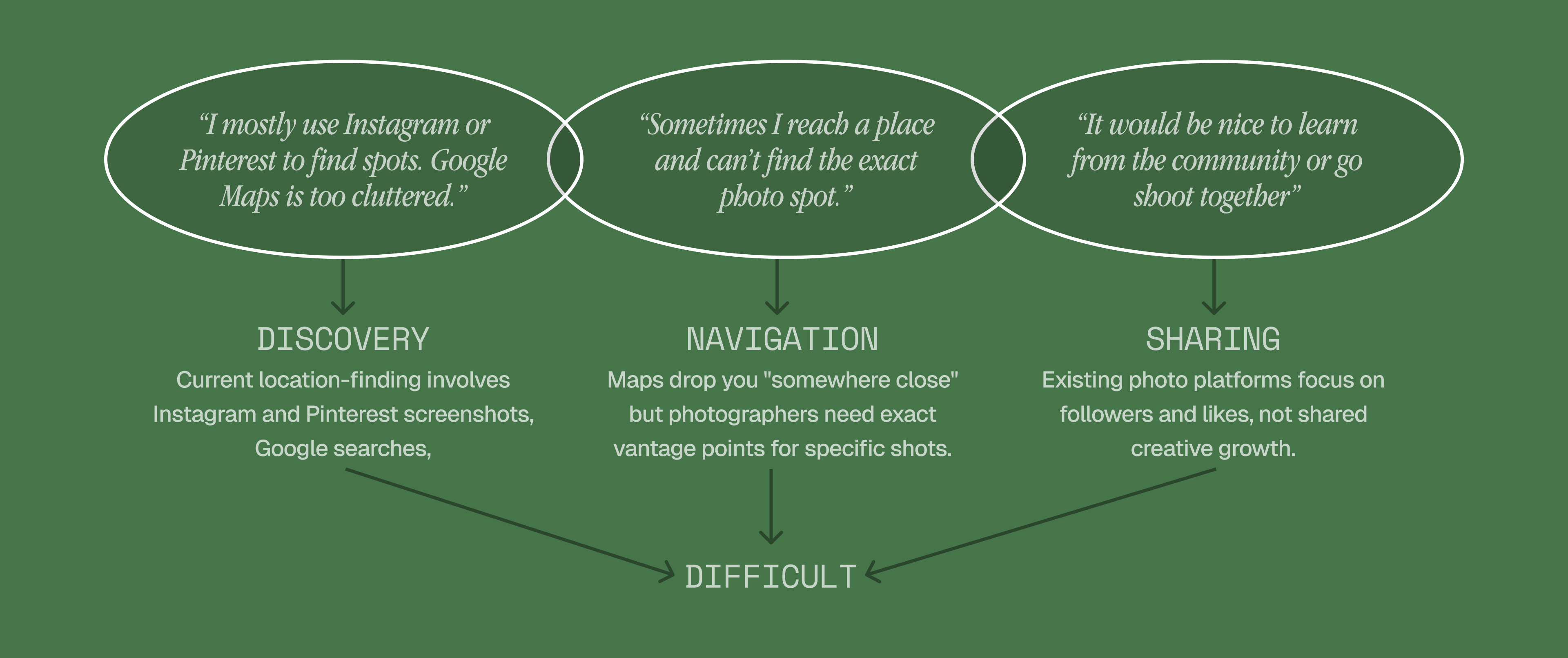
Key pain points from user interviews
I found the real friction wasn't technical—it was behavioral. They moved reactively between multiple tools, hoping for inspiration instead of planning for it. The opportunity was to design a tool that makes wandering intentional: a behavior-change tool that transforms how photographers approach the practice, built from two apps whose mechanics combined into something neither could do alone.
I synthesized my primary research into the persona of Lila — a 20-year-old college student balancing photography, travel, and coursework. I used Lila as a decision filter to guide my design decisions. Every significant design choice ran through the same question: does this solve Lila's actual problem, or my assumptions about it?
I visualized Lila's complete journey to highlight key touchpoints and emotions. This end-to-end view revealed the true product requirement: seamless emotional flow, not just feature integration.
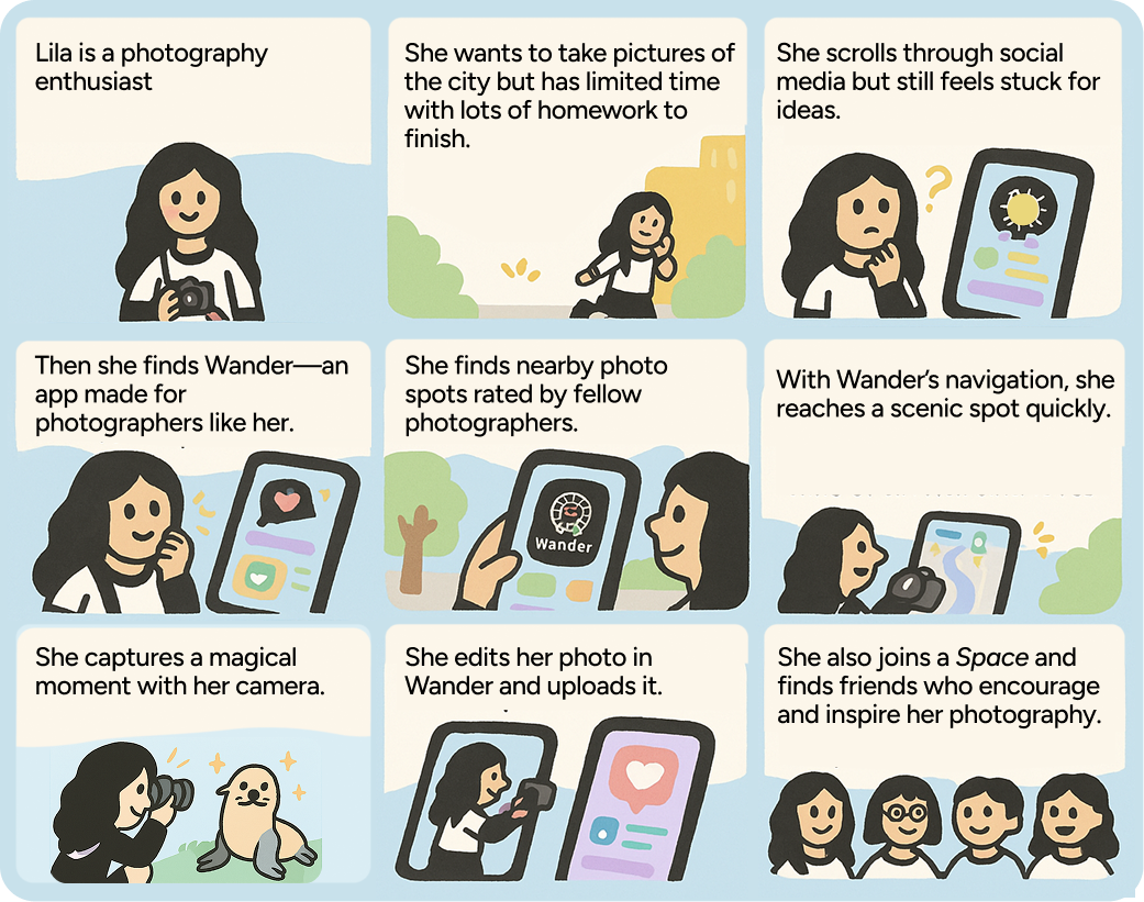
Storyboard: Image generated using ChatGPT. Text written by me.
My first version combined features from both apps in a tabbed interface—logical on paper, cognitively heavy in practice.
Photography involves two distinct mental states: discovery (open and exploratory) and creation (focused and time-sensitive). Forcing both into the same interface meant neither worked well, because users had to hold both mindsets simultaneously, which created friction. My breakthrough was a mode-based architecture matching UI structure to those mental states: Navigate mode for discovery and Studio mode for creation.
Color psychology: Dark backgrounds (VSCO influence) make photos the hero. Warm accent colors (Waze influence) maintain friendliness during the frustrating moments in navigation.
The personality conflict between Waze's approachable warmth and VSCO's sophisticated minimalism became an asset: the design system merged both, because the product genuinely needed both registers depending on what users were doing.
I identified two emotional states when someone like Lila would download my app Wander: creative stagnation (weekend boredom, Instagram-induced inadequacy) and inspiration overflow (seeing amazing content and wanting to recreate it). The entry point in that case would be emotional which meant the product had to deliver emotional value fast.
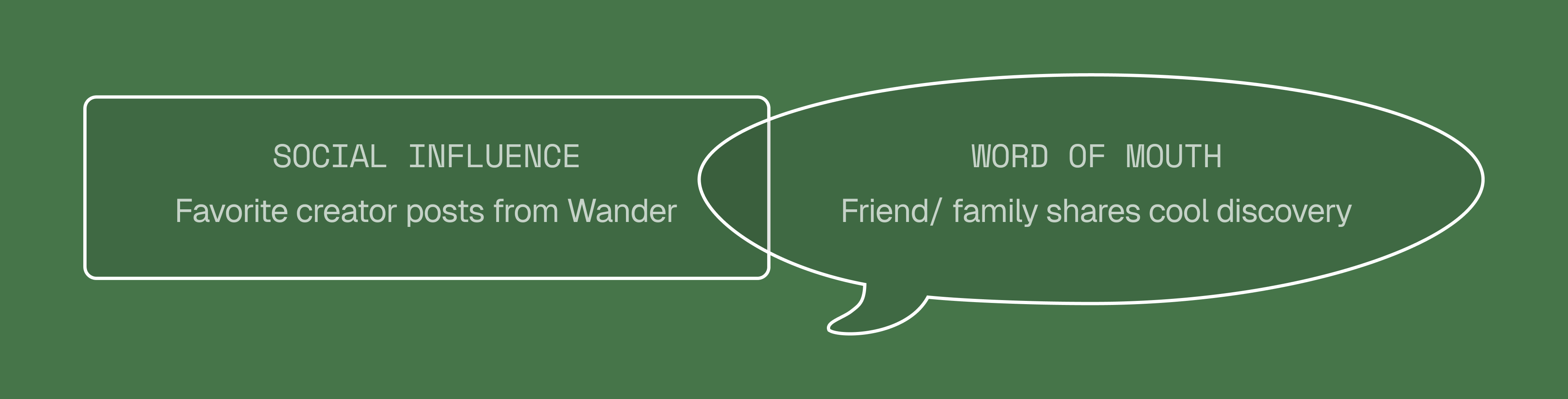
Download trigger mapping — the entry point is emotional
Most behavioral design focuses on getting users to install the app. The harder problem is what happens in the first session, when users have not yet experienced any value and are not invested.
Using Fogg's Behavior Model (B = MAP), I designed the FTUE to create desire before commitment. Users see value immediately, photography locations appear before signup and emotional investment grows before data exchange. Each tutorial phase expands ability (A) and motivation (M) while introducing contextual prompts (P). The product's engagement loop is simple: Inspiration → Action → Validation. Users discover new spots, shoot, share, and receive community feedback, reinforcing the cycle that sustains creative practice.
The FTUE strategy was built around one principle: desire before commitment. Users needed to experience value before being asked to give anything.
Most apps gate everything behind signup. Wander shows nearby photography spots immediately — before asking for anything. You see the value before you commit.
The tutorial starts with Navigate Mode — users browse beautiful spots and think “I want to go there.” Then they hit the “member-only” feature, creating scarcity-driven desire. Users see what they're missing and invest emotionally before sharing data.
Phone number → OTP → username → “Start Wandering.” No lengthy forms, just essential information. “Start Wandering” was a deliberate word choice — users feel they've joined something, not signed up for something.
Tutorial continues to Studio Mode — browse Spaces, see community features. It ends by showing where to find help later. Tutorials focused and re-access made easy.
Users explore on their own time — post their first photo, join a Space, opt into notifications, earning the “Community Joiner” award. Each step increases investment while providing immediate variable rewards. This is what Fogg's model predicts actually maintains engagement.
Users feel inspired by beautiful locations, navigate to create their own content, and receive community validation. That cycle keeps them coming back — transforming casual photographers into intentional creative explorers.
Designing for behavior means you can't evaluate success by looking at the interface alone. You have to ask: does this prompt the right action at the right moment? Does it create desire without manipulation? Does it make the right behavior easier, not just possible? Those are harder questions than “does this flow work?”
Working with unfamiliar material isn't a disadvantage. Having no prior opinions about Waze or VSCO meant I could analyze their interactions without defending them. Having no personal connection to photography meant every design decision had to be grounded in research. Constraints sometimes force better methods.
Microinteractions can turn first use into repeat use. Microinteractions during onboarding, like the brief animation revealing a photo location, are where curiosity is either strengthened or lost. You can perfect the architecture and still fail if those first touchpoints do not feel clear, responsive, and rewarding
Exceptional products don't just solve problems — they change how people think about the problem itself. Wander transforms “Where should I take photos?” into “How can I discover new creative perspectives?”