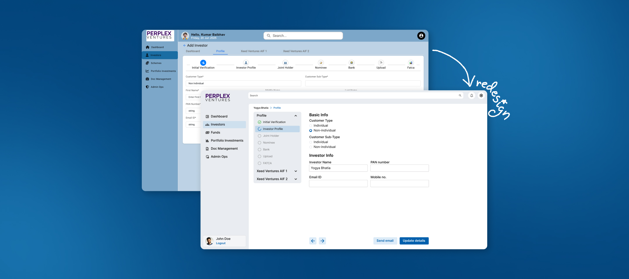
Fintech SaaS Platform
I joined as the sole designer on an Alternative Investment Fund (AIF) platform built by engineers for engineers. Users could technically complete their tasks but the interface had been built around getting functionality operational, not around supporting decision-making in a high-stakes financial context. Over 3 months, I conducted a systematic usability analysis, built a comprehensive design system from scratch, and designed 50+ screens for fund managers and investors while establishing design foundations that accelerated future development.
I had no background in AIF and needed to quickly understand unfamiliar terminology, user types, and regulatory requirements — while simultaneously redesigning the interface before pilot launch.
To tell the difference between a confusing interface and a genuinely complex financial process I had to understand the domain first. So before opening Figma, I spent the first week in three modes:
AIF basics, Indian regulatory requirements, competitor platforms
Going through every screen of the existing product, flagging every term I didn't recognize
Tracing how different user types (fund managers, investors, super admins) move through the platform
Each unfamiliar term became a research task. Domain knowledge made it possible for me to evaluate whether the design is working well.
I market every screen with color-coded violation categories of Neilson's 10 usability heuristics and also checked accessibility contrast ratios with tools.
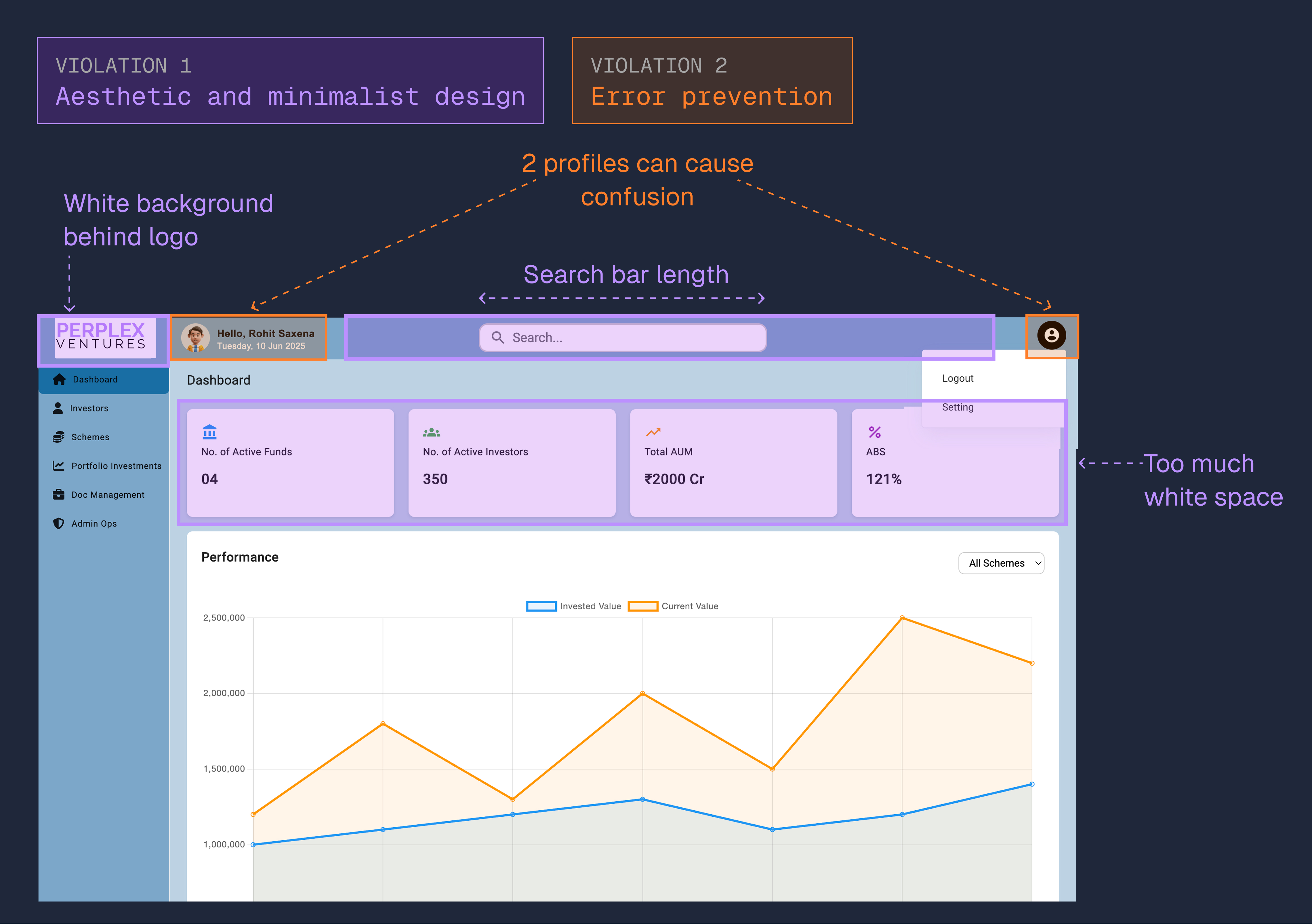
Example of how I annotated screens with violation categories
The pattern that I found across the screens was that the interface had been built around getting functionality working, not around supporting decision-making in high-stakes financial contexts. To convey this to the team, I collected the most serious issue examples and organized my findings by priority and shared them with the stakeholders and engineering team to get alignment on what to fix first and what to defer.
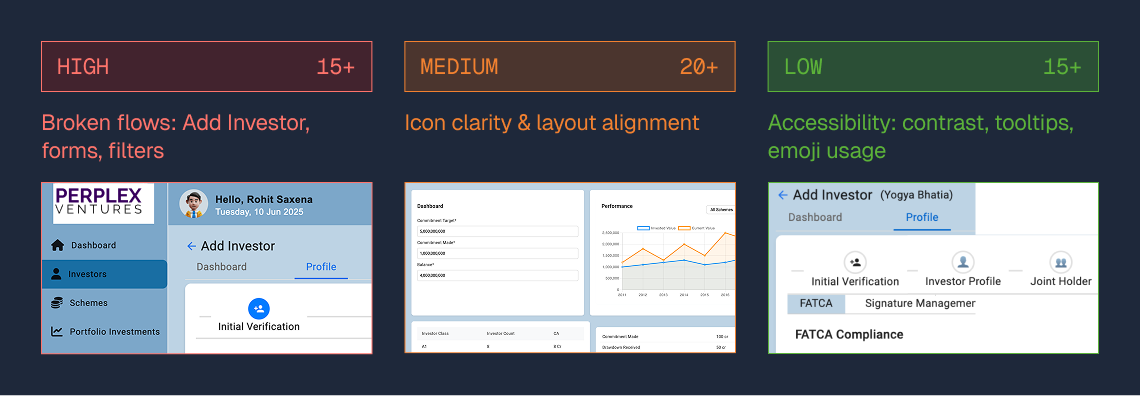
Stakeholder presentation snapshot
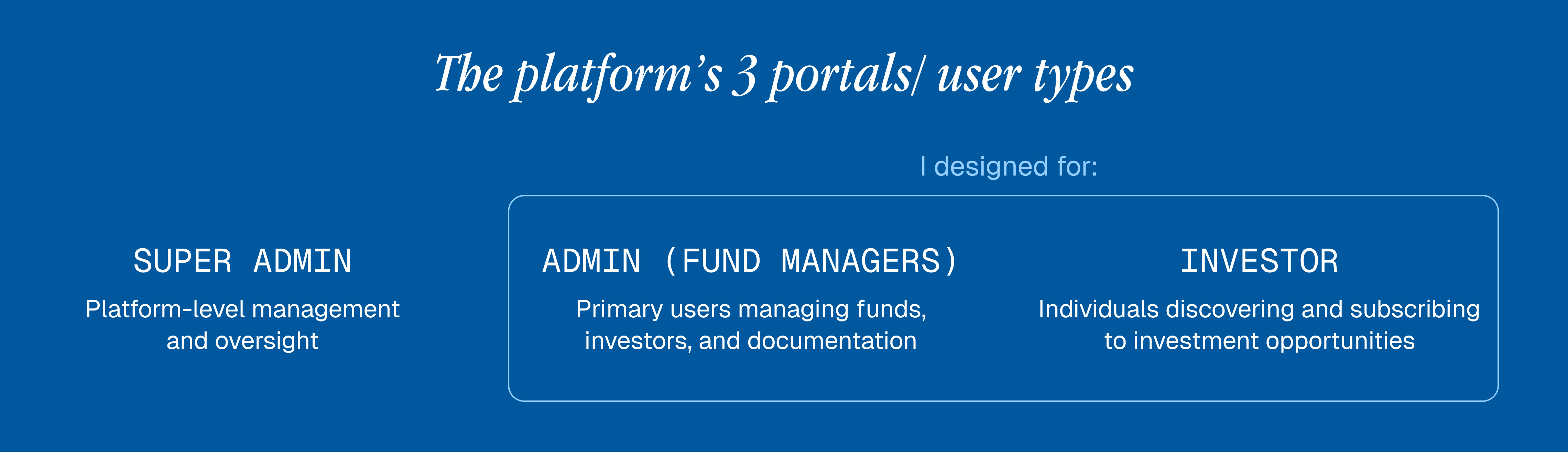
Overview of the three portals
Combined with their internal engineering constraints, the team gave me a detailed document listing everything that needed to be designed. That became my roadmap, and as the project continued, more was added to it. Before I started designing screens, I decided to build the system everything else would run on. This became the foundation for all future design decisions.
Complex financial data needs hierarchy you do not have to work out while reading. I established levels for page headers, section subheaders, body text, labels, and micro-copy — with defined sizes, weights, line heights, and colors for each. The goal was that users scanning investment details would never have to decide what was important. The design should do that work. The color palette followed the same logic: every color had a defined purpose and a minimum contrast standard beyond just an aesthetic role. I also standardized an icon library for all navigation nodes — consistent style and size throughout, so users would not have to relearn what an icon means on a different screen.
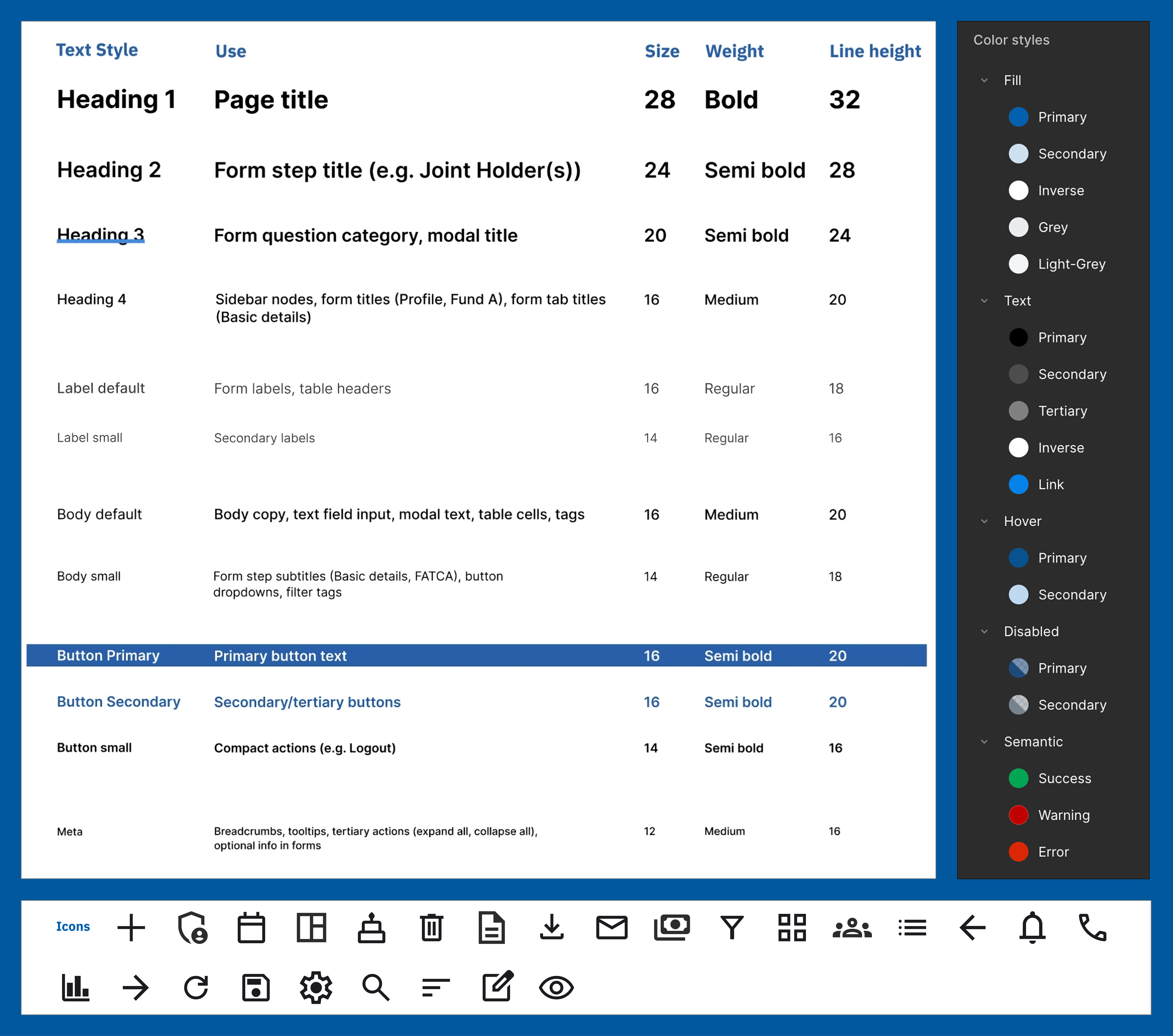
Design system: Typography, colors, and icons
Another core part of the foundation was the component design system. I defined every button variant with precise dimensions, padding, and interaction states. Because forms appeared on many of the Admin portal screens, I designed default, focused, filled, and error states for all input types to ensure consistency and clarity throughout the experience.
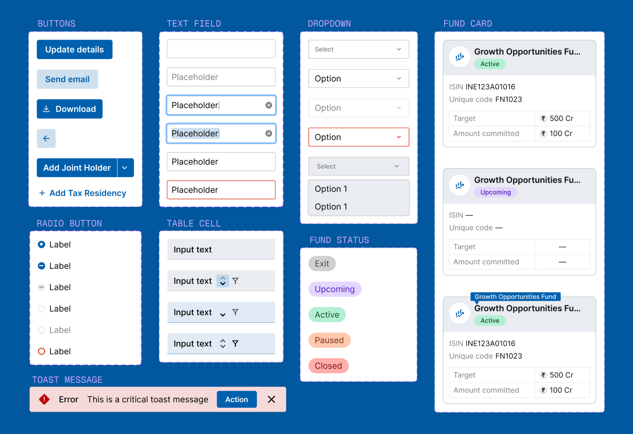
Components like buttons, text fields, dropdowns, cards and more with states
By the end, developers had everything they needed to build new features without design becoming a bottleneck. These elements became reusable building blocks — scalable, consistent, and ready to support future growth.
With the design system in place, I tackled 12 admin pages and 5 investor portal tabs. Each came with challenges that couldn't be solved by convention alone.
Fund managers needed access to six major sections plus utility functions—on screens already heavy with financial data. Research into power‑user navigation patterns revealed something counterintuitive: experienced users value speed over discoverability. They’ll memorize locations, as long as those locations stay consistent.
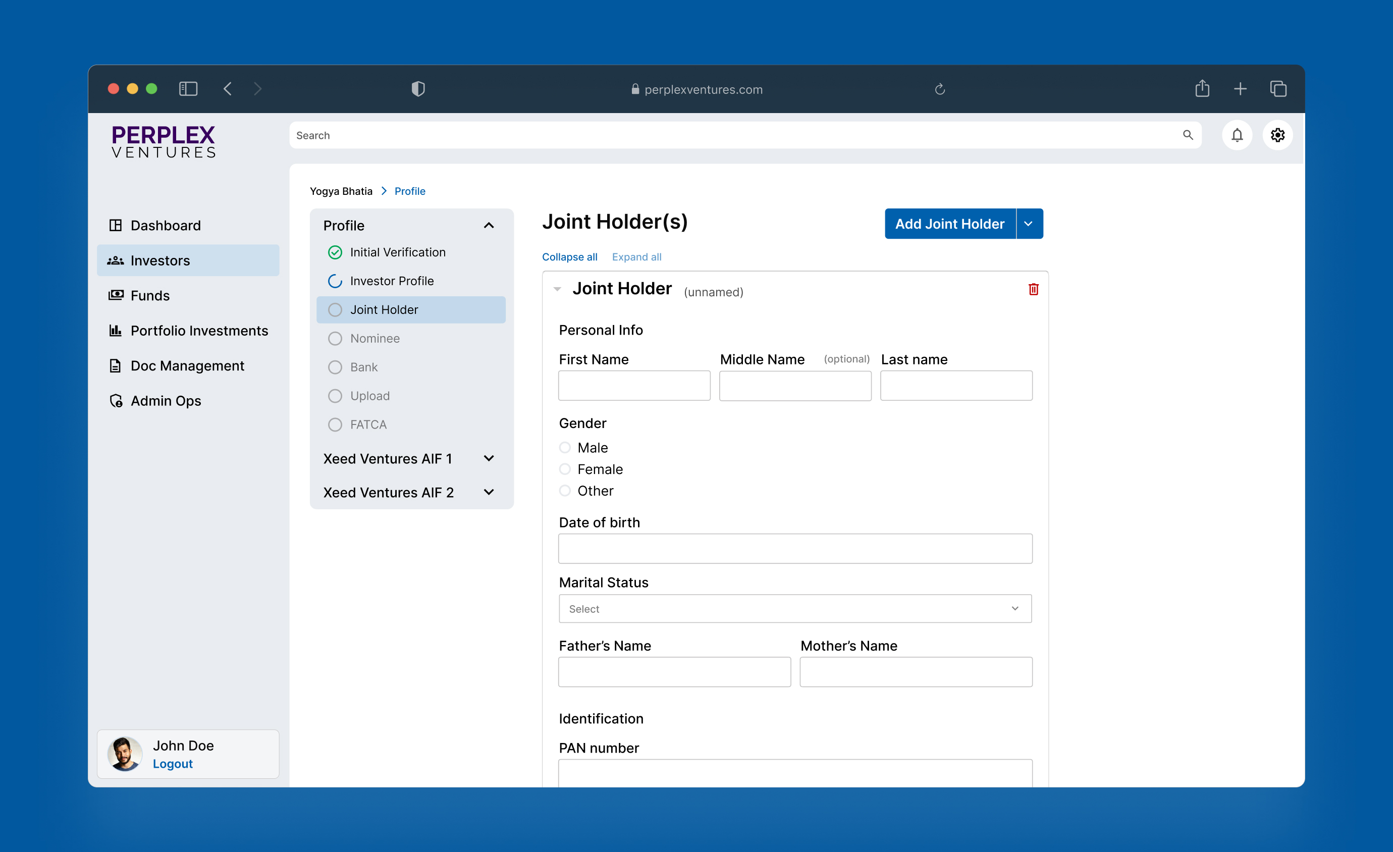
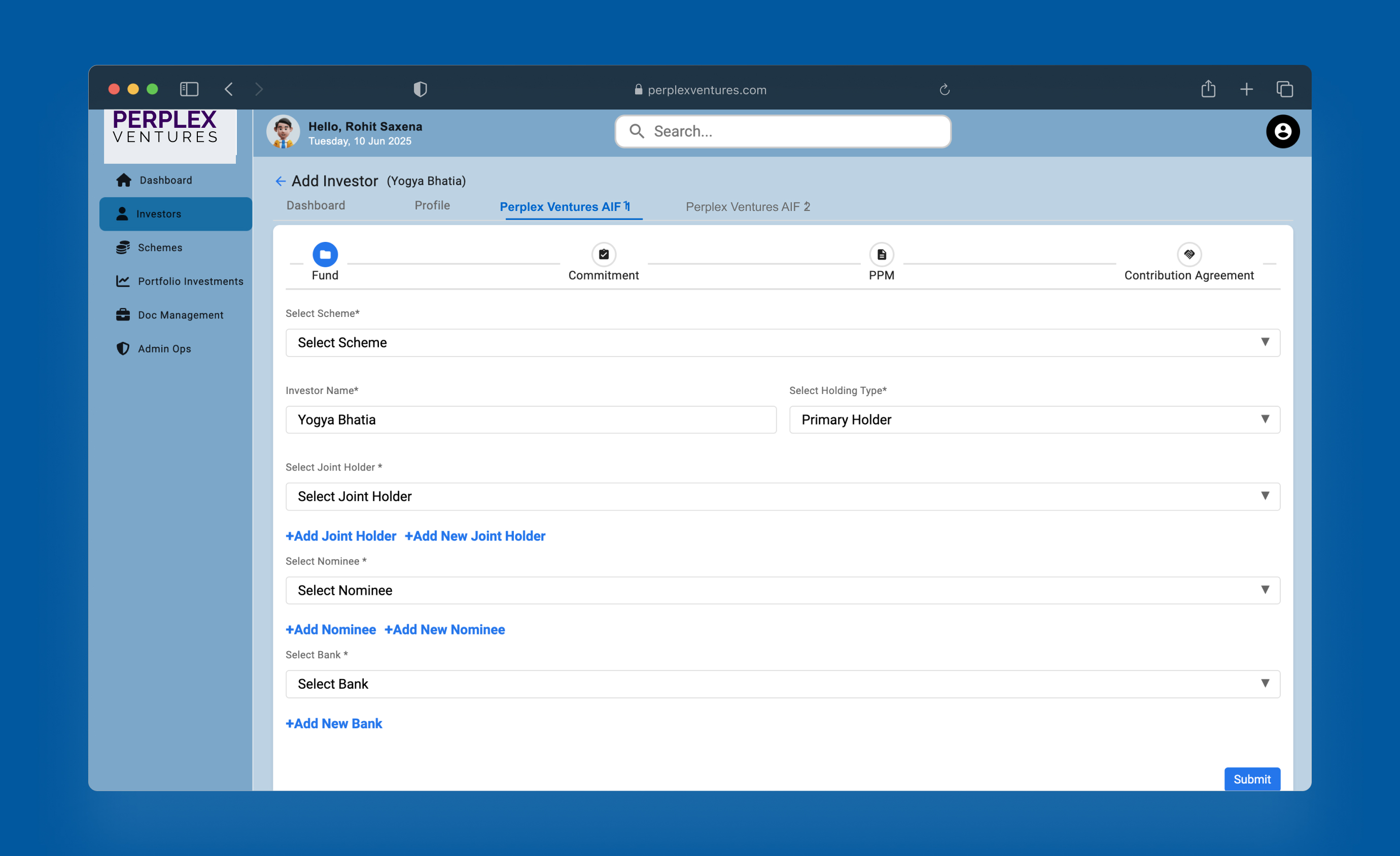
Sidebar navigation design
Investor onboarding required capturing extensive information without overwhelming users at a high-stakes decision point. Two principles guided the design: a 600 px content width to reduce eye strain, and a maximum of two fields per row to lower cognitive load. Each step focused on one logical group of information, with progress steppers revealing all steps upfront—no surprises.
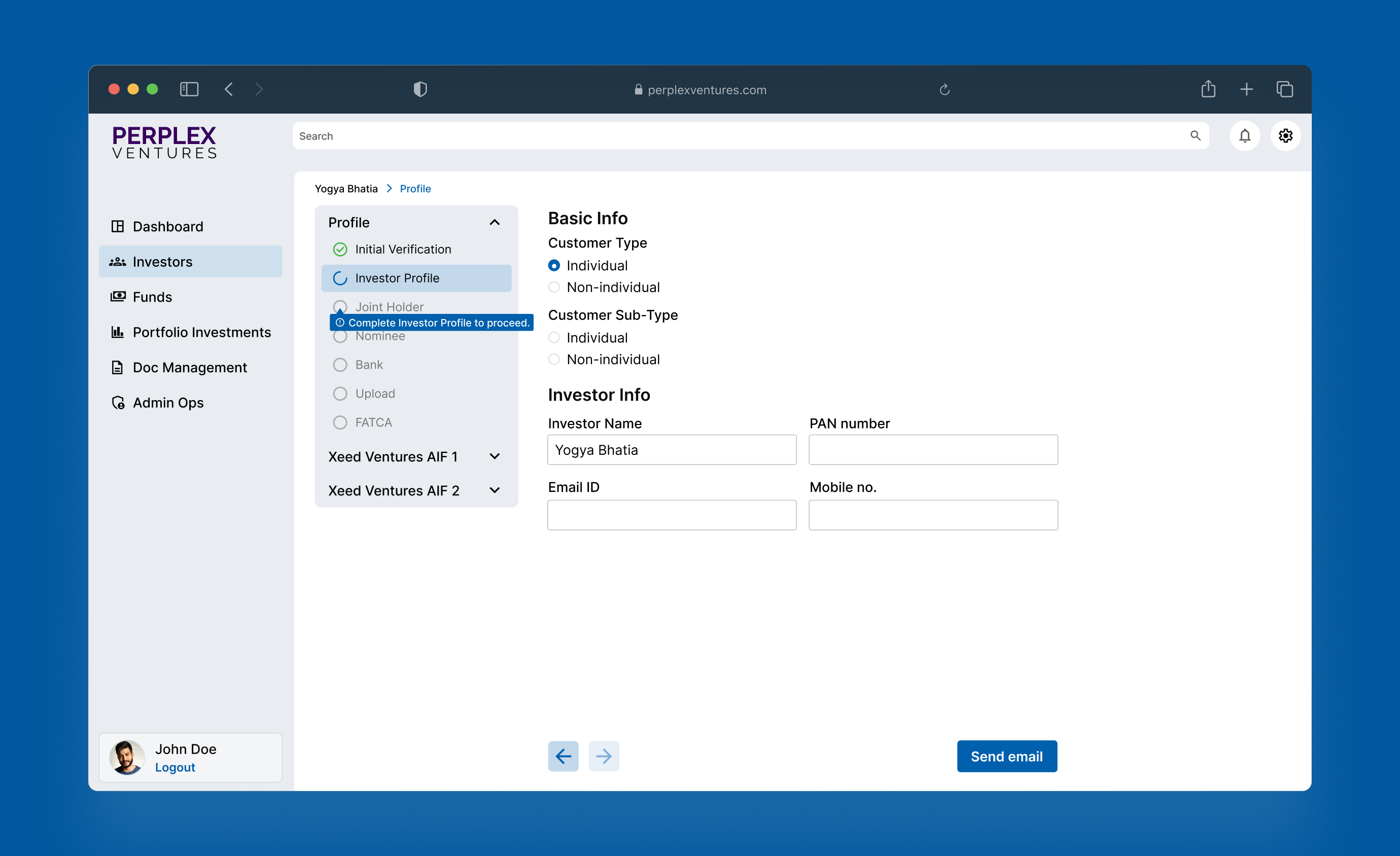
Multi-step form with progress stepper and tooltips for complex onboarding
One of the most complex pages. Users needed to manage document templates, preview PDFs, and edit variables — but the rules differed by template type. I created a Data Table with global and column-wise filter and sort. One of the most complex screens: users needed to manage document templates, preview PDFs, and edit variables under rules that varied by template type. I designed a data table with both global and column-wise sorting and filtering to handle those differences efficiently.
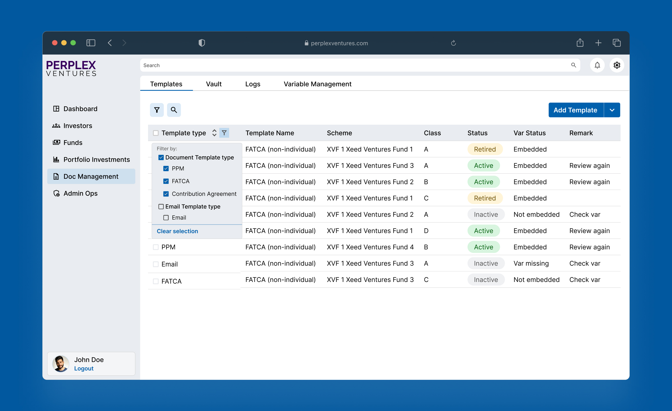
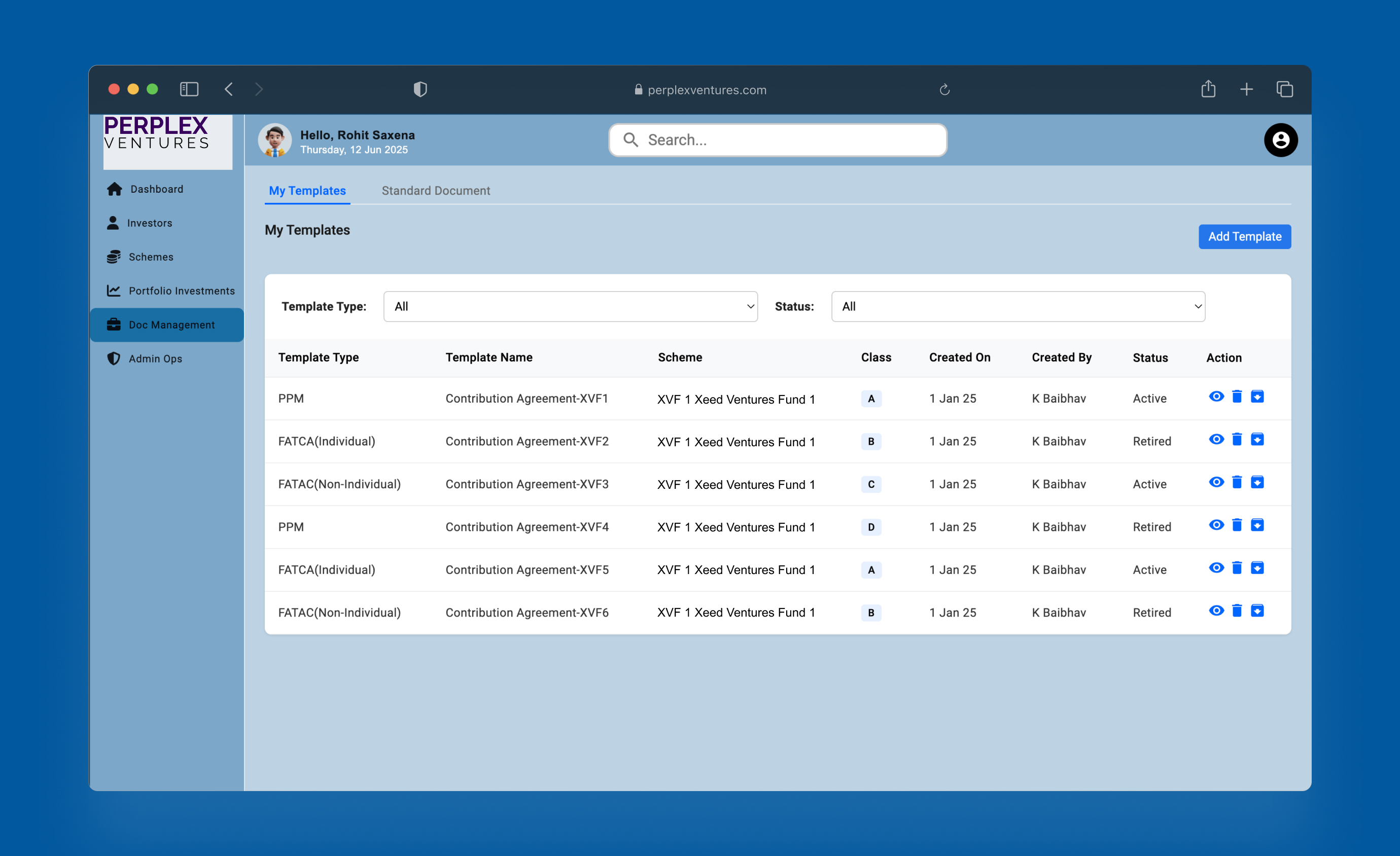
Document template management screen design
Midway through, I learned that variables embedded during PDF upload couldn't be fully edited—only their metadata could be modified. The UI had to clearly distinguish editable from view-only states. Trying to hide system limitations only creates user confusion.
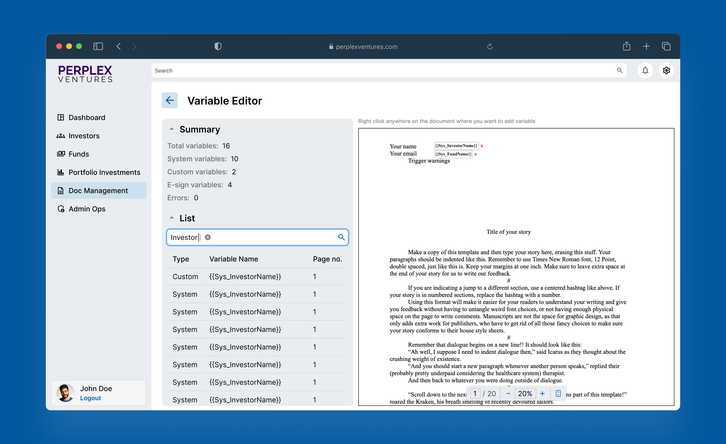
Variable editor for document template
The variable editor taught me this — designing before fully understanding system constraints can cost a full iteration.
The component library provided everything the team needed. New features could be assembled from existing elements while preserving visual and behavioral consistency. Developers rarely had to ask design questions because the system made answers predictable. The platform evolved from feeling fragmented to functioning as a unified product that stakeholders felt confident presenting to pilot users.
If I were starting this project now, I would work differently in two ways:
Push harder for user testing with real fund managers. My process relied on heuristic analysis and financial interface research, but I never observed an actual user try to complete a task. That is the question I cannot fully answer from this project.
Deepen integration of AI rapid‑prototyping tools. I used ChatGPT to research best practices for dense financial tables, validate component decisions, and Google Stitch to explore interaction patterns quickly. With today's AI-driven prototyping tools, I would lean on them even more after defining the core design system, accelerating iteration cycles without sacrificing structure. That is the part of this workflow I am most interested in developing further.
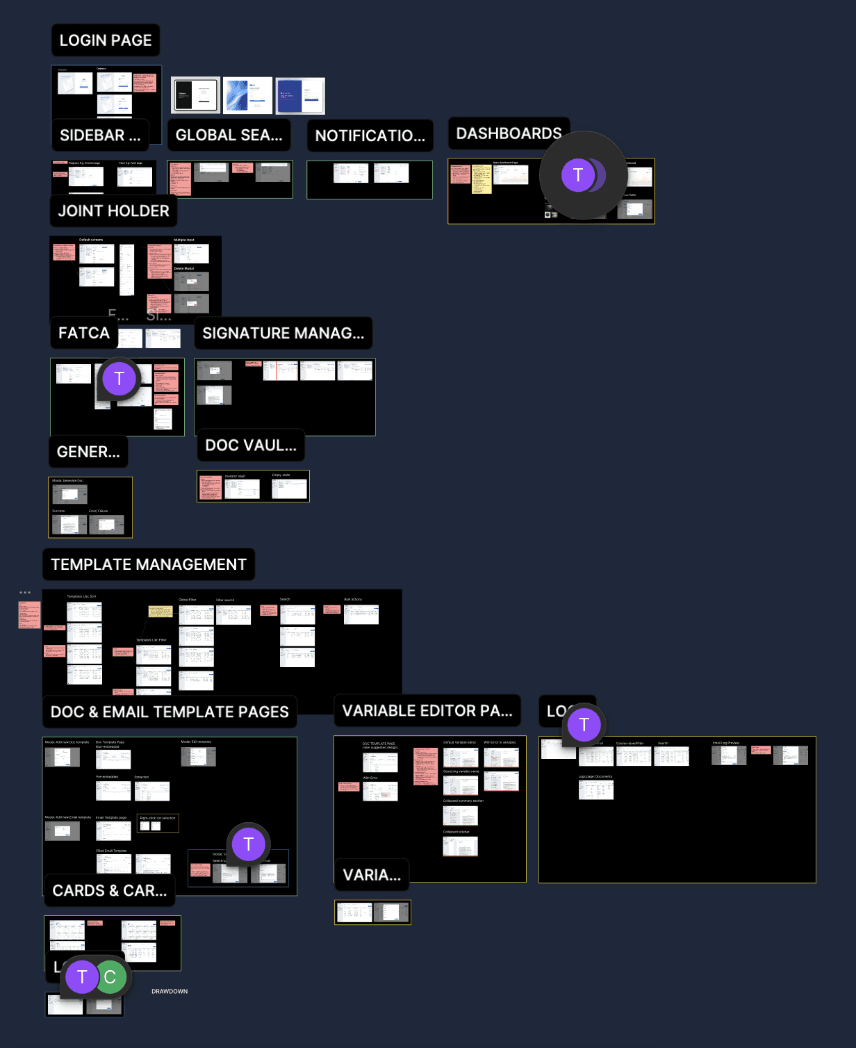
Part of the final deliverables